Design for all
Accessibility Boost for the TMS
The old Turvo UI struggled with legibility: thin fonts, inconsistent typography, and colors that often lacked visual clarity. In Fleet, we reimagined accessibility — building typography tokens, curating a shade-based color palette, and streamlining designer decision-making. The result? A more legible, usable, and systematized product that balances beauty with usability.
impact
100%
WCAG AA
90%
WCAG AAA
/ problem
It Didn’t Look Good, and It Didn’t Read Well
This wasn’t a “quick fix” situation — we needed to rethink the foundation.
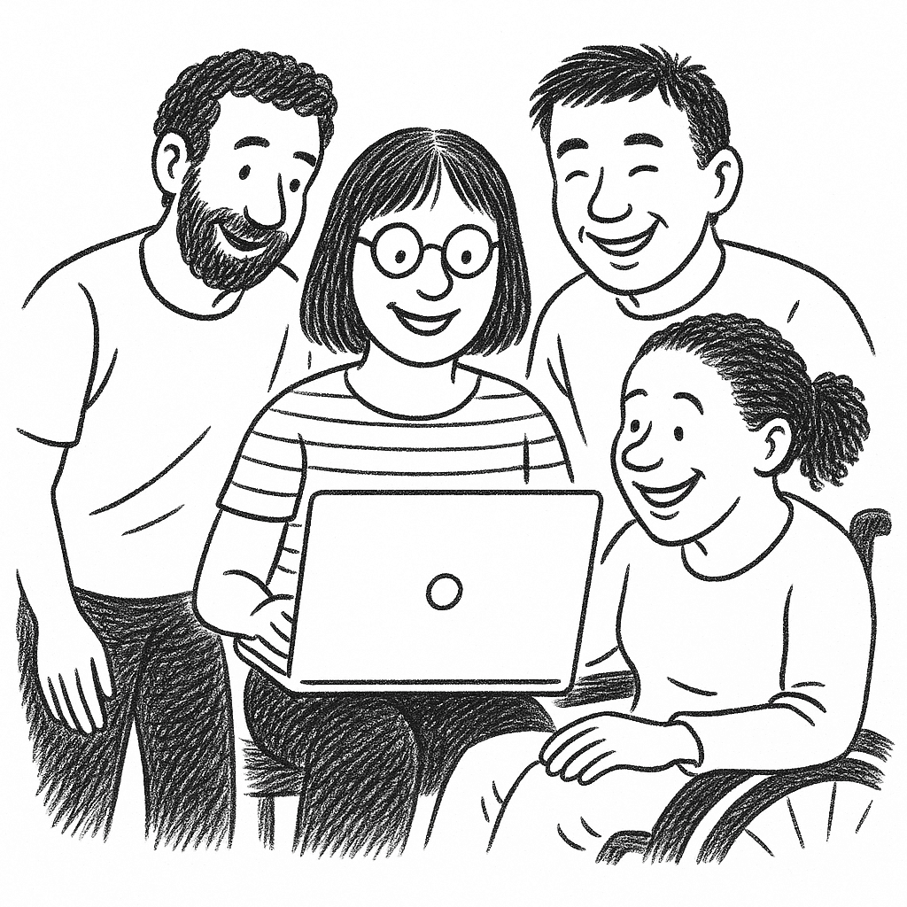
The original Turvo UI wasn’t winning design awards — and more importantly, it wasn’t winning user trust. Fonts were too thin and too light, giving the interface a washed-out feel and making reading uncomfortable. The color palette? A grab bag of random hues with no system, leaving designers to guess and check contrast manually. Without typography or color tokens, the design lacked cohesion, and accessibility fell through the cracks.
Lack of typography hierarchy
The typography lacks a clear hierarchy, making it difficult for users to discern the importance of various elements at a glance. This uniformity in font weight and spacing results in a visually overwhelming experience, where critical information gets lost among less significant details.
Lack of a color palette
The previous color scheme is very preliminary. It did not provide a comprehensive guidance on how to use the color and the color are not coordinated.
/ research and solution
Typography with backbone
We retired the spindly, underfed fonts and gave them structure.
During my research on the other major design system, I deconstruct the components so I can have a good understand of them across different design system. By dissecting it into smaller element, I have a better understanding of how each element contributes to the function of the complete component.
This exercise helps me to finalize the design for Fleet inputs, which will be able to offer the clear visual message even in a super busy context.
Increased weights
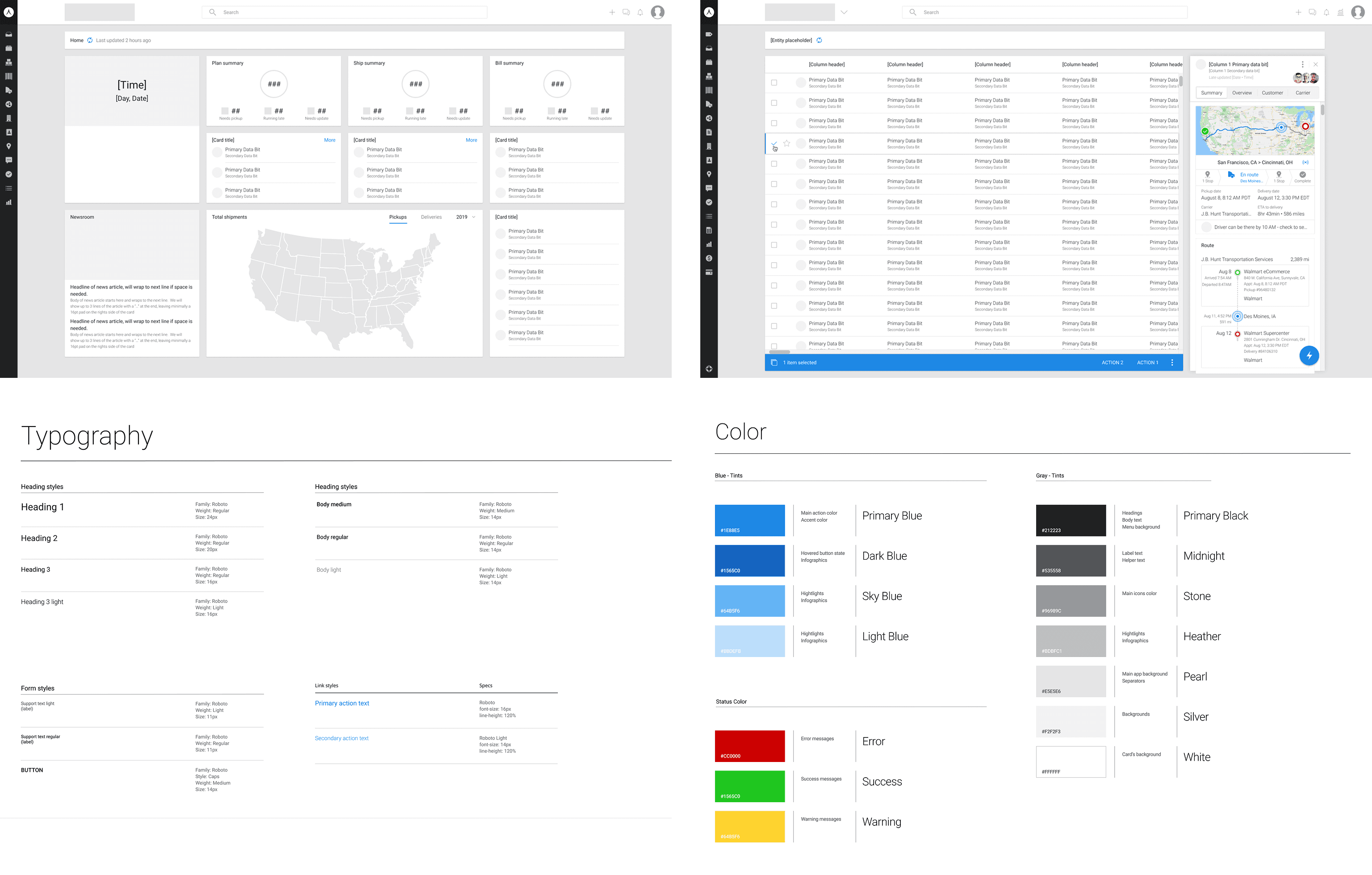
The previous font generally has a 300 weight, which is way too light. Considering a large number of users are using a 1080p monitor, increased weights for fonts will increase the readability greatly.
A typography token system
Introduced a typography token system for size, weight, and line height, and strengthened hierarchy so headings, labels, and content stand out in the right places
/ research and solution
A palette you can trust
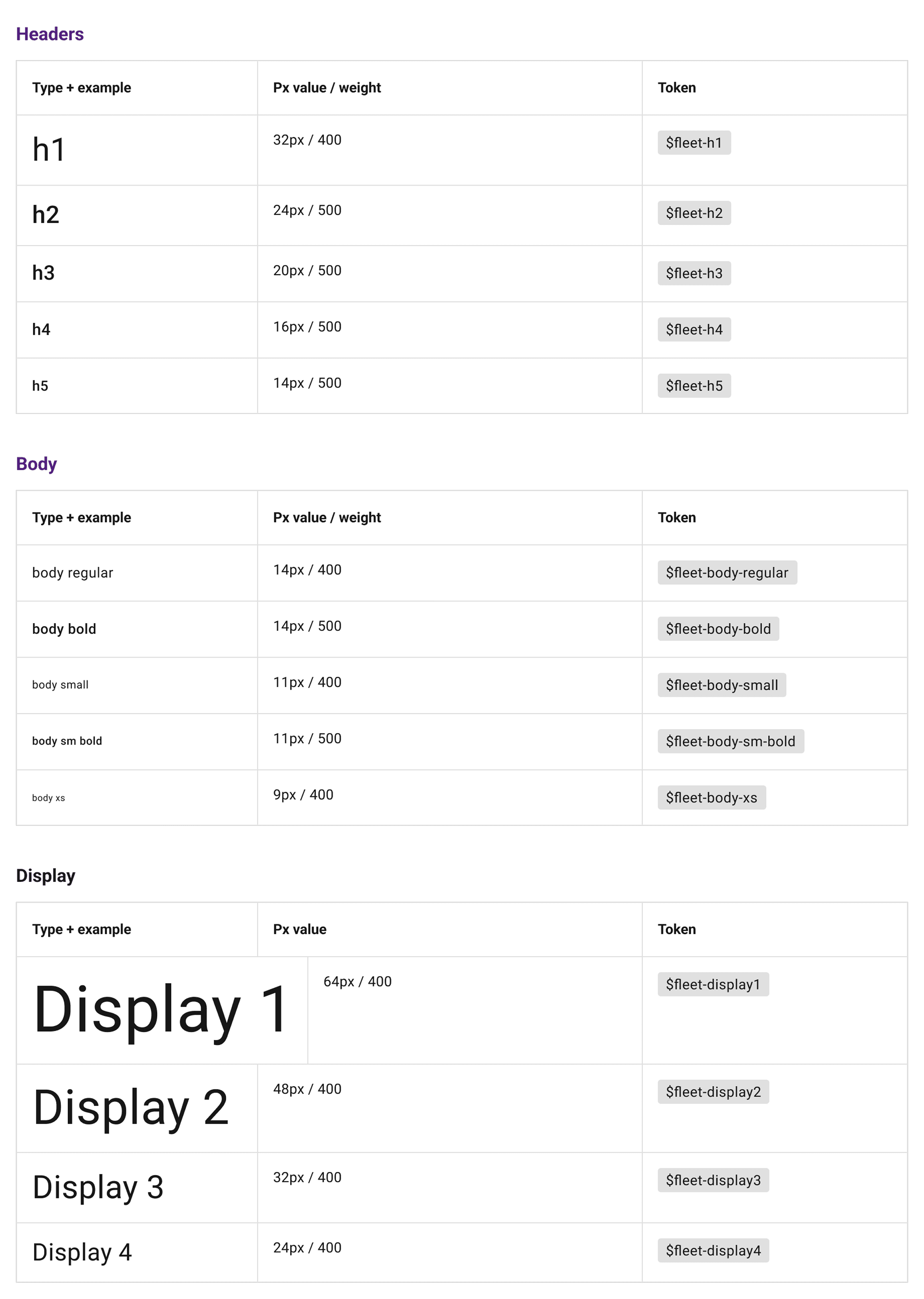
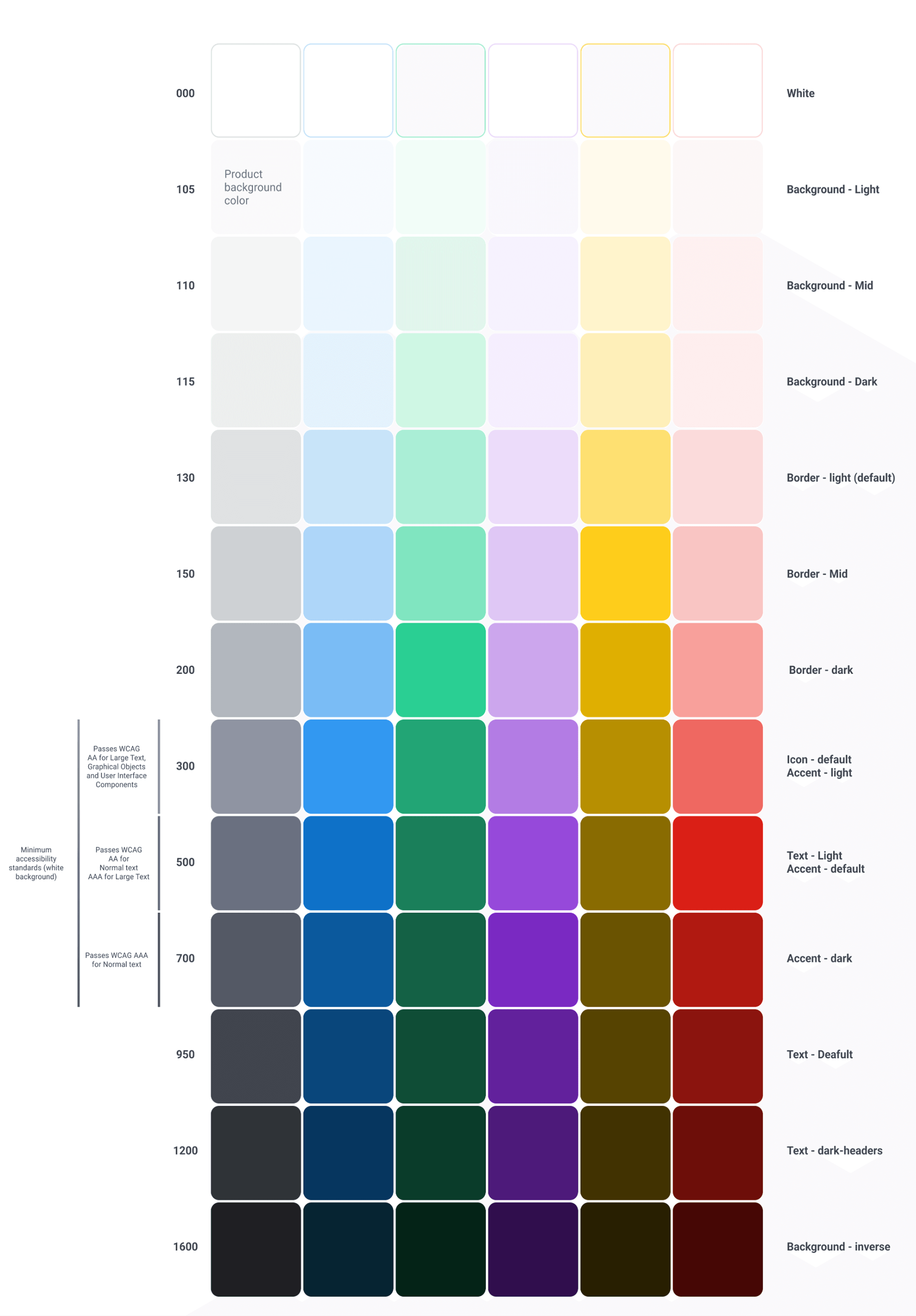
Instead of a chaotic assortment of colors, we curated a core set of main colors and built shade scales for each.
Contrast-aware shade
Shades are named by number (Blue-100 through Blue-1200) for quick comparison. It also help reduced decision fatigue for designers — no more “pick a random blue” moments
Design without the guesswork
With Fleet, designers don’t start from scratch on every screen. The tokens and palette give them a toolkit that’s accessible, modern, and visually consistent — and that frees up more time for solving real UX challenges.
/Before & after snapshot
Element
Before
After (Fleet)
Appearance
Outdated look, washed-out text, inconsistent styles
Modern, polished UI with balanced typography and color
Typography
Thin (300 weight), inconsistent usage
Tokenized typography, consistent weights (400–500), improved hierarchy
Colors
Inconsistent, uncoordinated hues, poor contrast
Curated core palette, named shade scales, contrast-aware combinations
Designer Workflow
Manual checks, high guesswork
Clear system, faster and more confident decisions
User Experience
Low readability, low engagement
Legible, visually appealing, and easier to navigate
/ impact
Accessibility is the foundation
Fleet isn’t just more accessible — it’s better-looking, more functional, and more trustworthy. By addressing accessibility at the system level, we improved the experience for everyone, not just those with specific needs.
Readability went up for all users
Bolder typography and thoughtful color pairings make content easier to scan, even on small screens or in bright sunlight.
Visual appeal improved alongside usability
Accessibility doesn’t mean “plain” — Fleet proves you can meet standards and look modern and polished.
Designers and developers work faster
With tokens and shade scales in place, accessibility compliance becomes part of the default workflow, not an afterthought.
We built for the future
As new features roll out, they automatically inherit accessible styles, reducing tech debt and ensuring a consistent experience.