Fleet
Build a Design System for Modern TMS from 0-1
My Role
I played a central role in evolving Fleet into a modern, scalable design system that improved consistency, efficiency, and accessibility across the platform. I audited UI patterns to identify gaps, then created standardized, technically feasible components with clear guidelines—enabling teams to build faster while maintaining quality.
To future-proof the system, I introduced tokens, flexible spacing, and theming strategies adaptable to multiple use cases. Beyond component design, I led documentation, established contribution workflows, mentored designers, and drove adoption through trainings and design reviews, embedding Fleet into cross-functional workflows.
Awards
Company-wide recognition received for the creation and impact of Fleet, which became the single source of truth for design and significantly improved collaboration between design and engineering.
“He(James) contributed significantly to our design system, elevating it to a whole new level-it became much more robust, user-friendly, and visually appealing thanks to his work.”
-- Sasha, coworker
Impacts
40%
Reduction of QE/UI bugs through token adoption
80%
Cut in UI inconsistencies
90%
Reduction in UI design time for designers
300+
Components built
Case studies
Learn more about how Fleet makes changes

Keep scrolling to learn the holistic process and impact of project Fleet
01 · project context
I noticed the problems and pitched to established an unified design system to address these challenges.
Problem Before Fleet
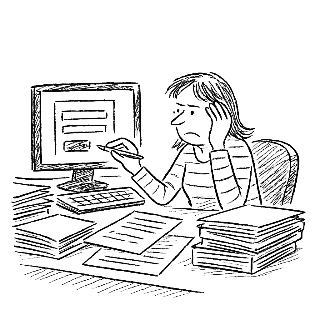
UI inconsistencies across features
Slow development cycles due to lack of reusable components
High QE ticket volume for UI mismatches
Hard to scale across teams
Developers did not consistently reference design files, leading to mismatches between intended and implemented designs
Inconsistent visual language and interaction patterns weakened user trust and made onboarding harder.
Accessibility standards were applied inconsistently, creating compliance risks.
Fleet was created to address these challenges by
Establishing a single source of truth for all UI components and interaction patterns.
Modernizing the look and feel of Turvo while ensuring consistency across the platform.
Bridging the design–development gap with shared documentation, naming conventions, and component libraries.
Accelerating feature delivery and reducing QA workload by eliminating redundant component creation.
Enabling scalability for new markets and features through reusable, tested design assets.
Team
Junru Ruan, Lead UX Designer
Joseph S., Contractor UX Designer
Gabe G., Senior UX Designer
Manisha B., Senior Manager of UX
Kalai, Lead UI Developer
Lalith, UI Developer
Designer notes
We knew from the start that Fleet wouldn’t be a “one-and-done” project. A design system is a living, evolving organism — and like anything alive, it needs care, feeding, and time to grow.
With a small engineering team, we had to be realistic. Instead of trying to overhaul everything at once, we took the long view. The truth is, the leap from 0 to 1 is often the hardest — harder than 1 to 100. And right now, Fleet is making that leap.
To keep momentum without burning out the team, we broke the work into two phases:
01
Phase 1
Design and build Fleet, creating the single source of truth for Turvo’s UI.
02
Phase 2
Modernize the TMS UI by reviewing and refining every component in Fleet.
02 · process breakdown
Research, Guide, Collaboration
To understand the scope of the problem, I conducted a full audit of existing UI components across the platform. This included reviewing live pages, design files, and code repositories to catalog inconsistencies and redundancies. I interviewed designers and front-end engineers to identify pain points in their workflows, learning that many teams were improvising component styles due to the absence of a centralized library.
These insights made it clear that a well-defined, centralized design system would not only improve design consistency but also streamline collaboration, reduce rework, and accelerate product development across the board.
Principle
Component Library Creation
Built 400+ components in Figma with clear variants and tokens
Documented usage guidelines and edge cases
Developer Collaboration
Set up a workflow for syncing design → code (Storybook integration plans, delayed)
Created naming conventions to match dev frameworks
Rollout & Adoption
Introduced Fleet in phases (core UI first, then complex patterns)
Conducted internal workshops & onboarding sessions