Re-design the inputs
Help users fill the form faster and easier
As a Transportation Management Service product, Turvo has a lot of forms for users to fill and a lot of information is needed due to the nature of logistics industry. Different types of data and inputs are all group together, making it hard for users to follow the form, to tell the type of the input.
Without researching each form input pages and redesign each form, how can Fleet help to deliver a better experience to our users? How can we improve the efficiency by improving the design of the input components?
impact
20%
Decrease in the individual components used per form
100%
Satisfaction for the component redesign

/ problem
There are too many forms and inputs
We want to make sure all the important information is captured, but we also don’t want users get lost all the time.
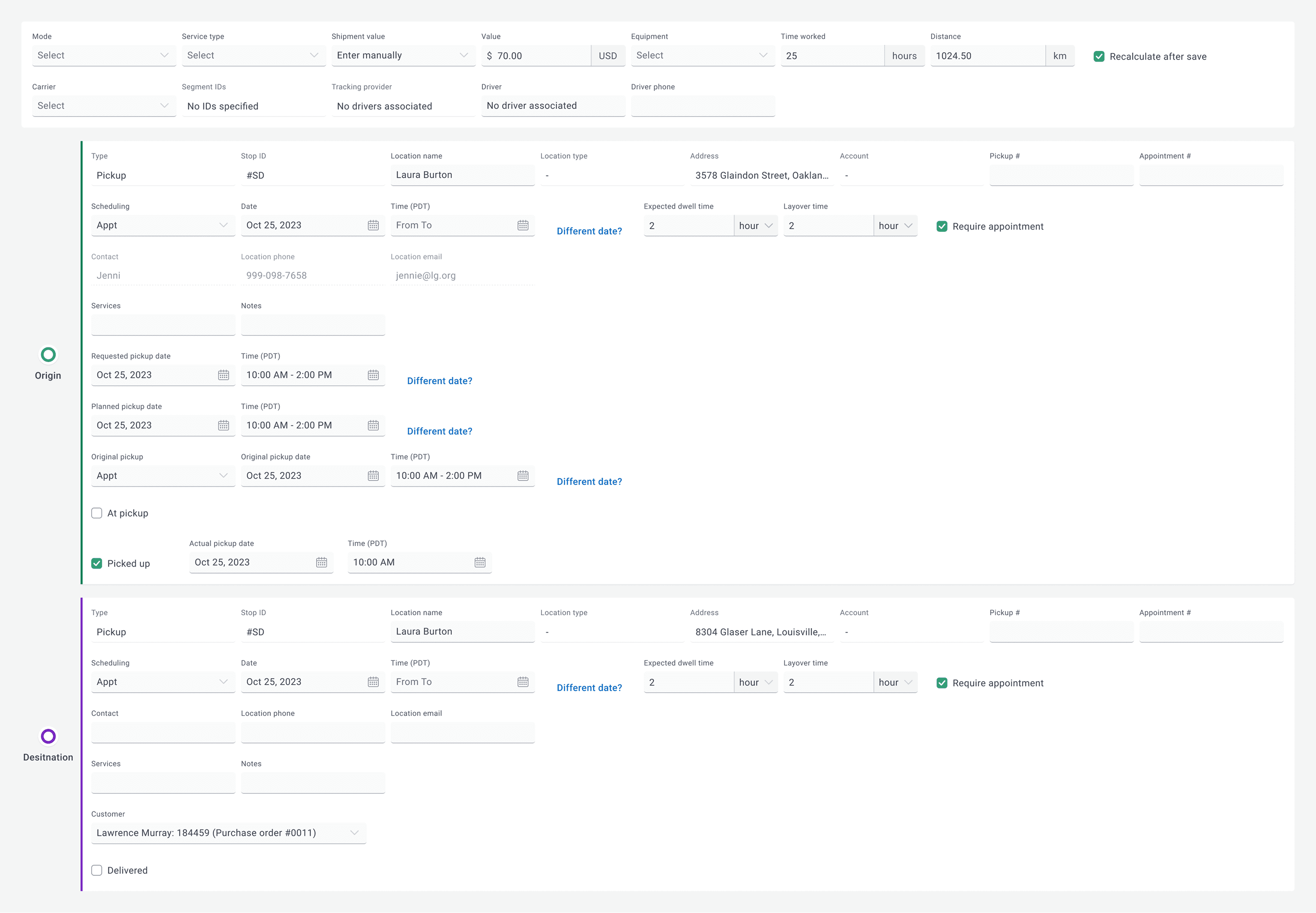
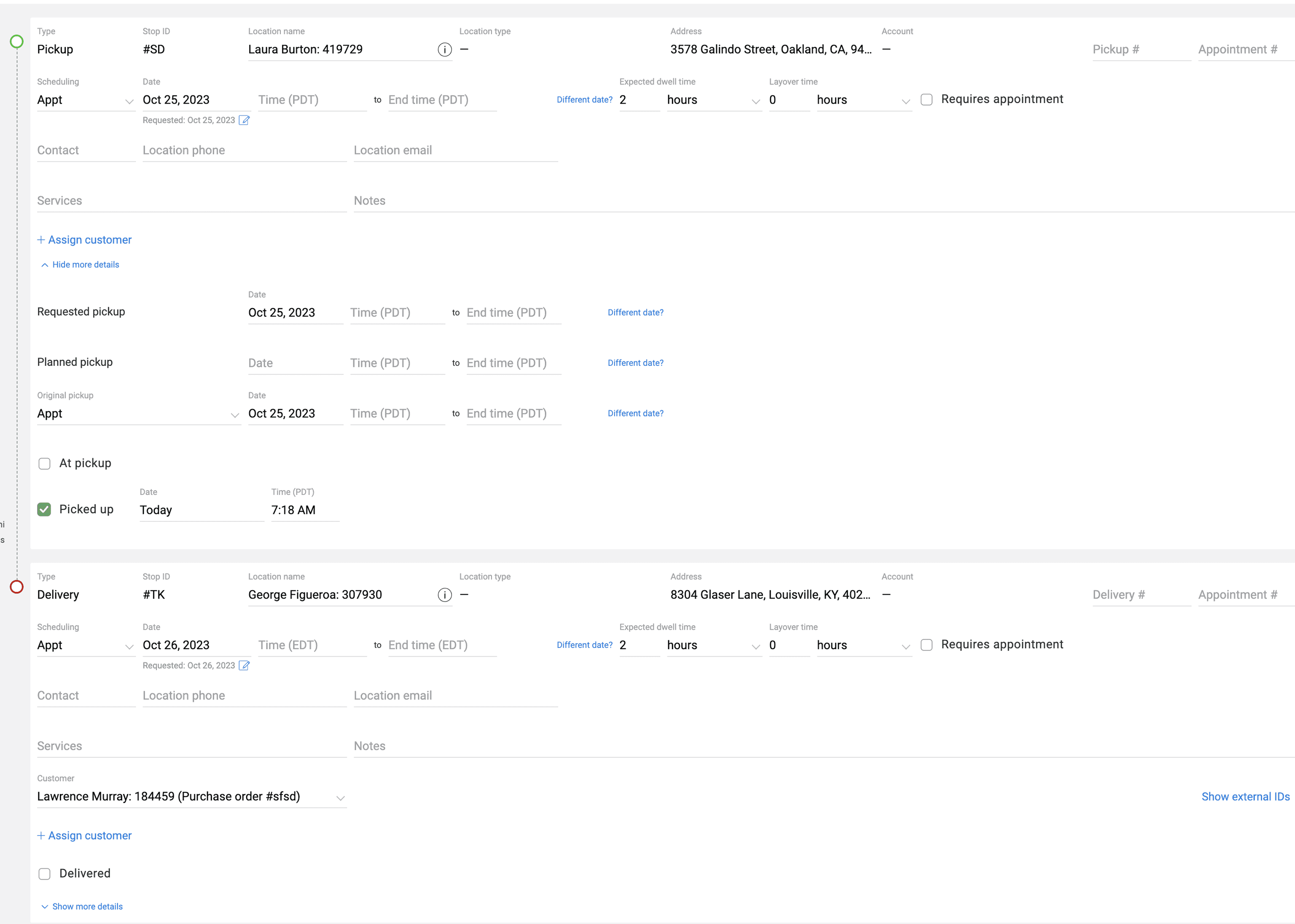
Here is a very typical screen of the product, filled with numerous fields that are probably added from different releases, and from different customer requests. We can, indeed, research and clean up this form, however, there are thousands of forms like this in the product right now. Also, the input components are design poorly and inconsistently. The developers grabbed them from a Material Design Library of certain year and did not adapt them to the product’s need nor the logistic ecosystem.
Lack of hierarchy
Font weights and spacing don’t establish strong hierarchy — everything looks equally important. By a quick glance, it is hard to focus or distill the hierarchy of this screen.
Excessive input fields
Contact, services, and notes are all separated with lots of blank space, forcing extra scrolling. The form spans very wide, making it harder to scan since users’ eyes must travel horizontally. There are also dozens of tiny input fields asking for users attention.
Visual unclarity
The grey-on-white text and light divider lines reduce readability. Yet, uncommon action links (“Different date?” “Show more details”) takes too much attention.
/ research and solution
Text, border and fill to create clear visual message
I want to re-design the input so they can tell users clearly the type, status, and the request of the input
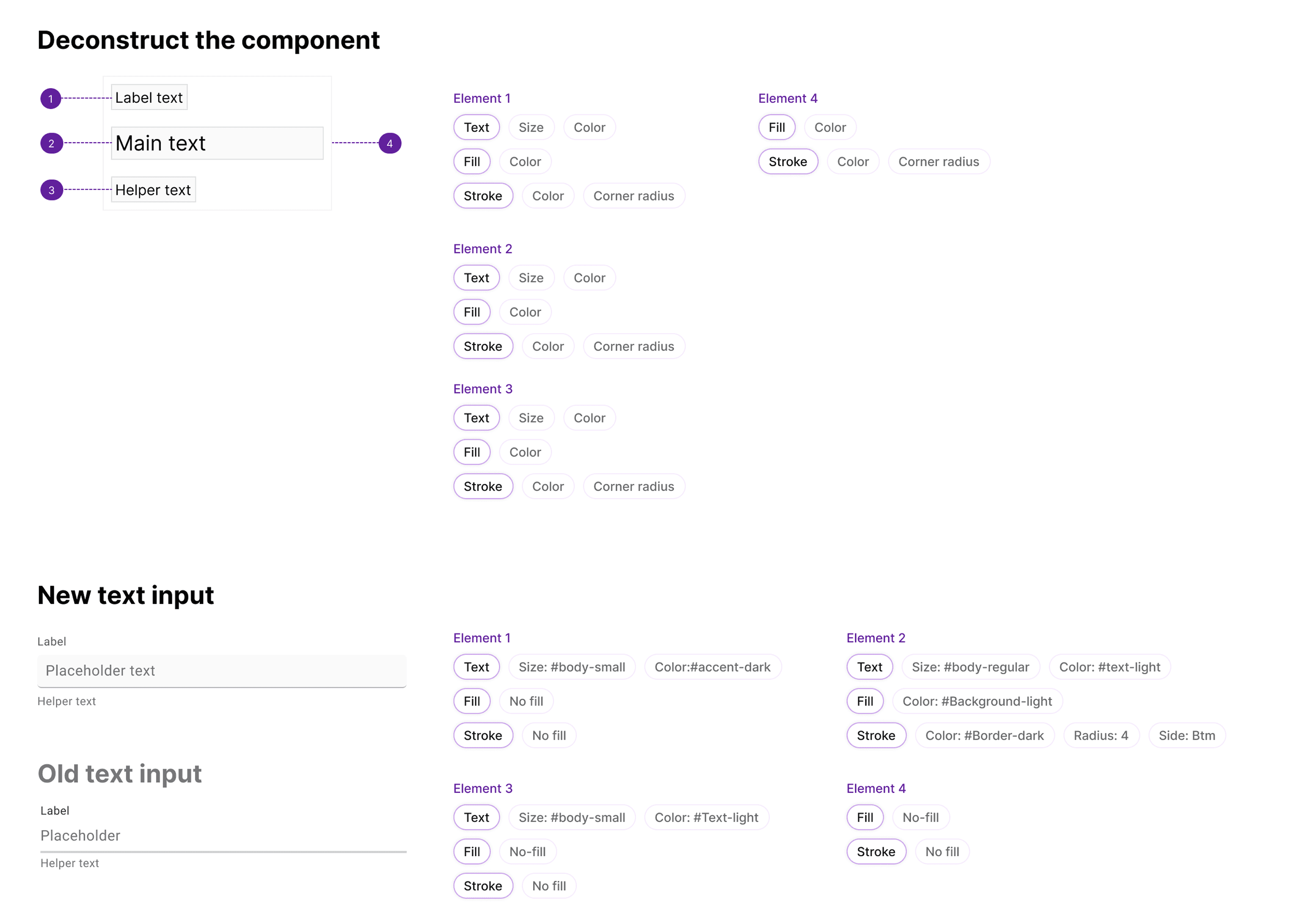
During my research on the other major design system, I deconstruct the components so I can have a good understand of them across different design system. By dissecting it into smaller element, I have a better understanding of how each element contributes to the function of the complete component.
This exercise helps me to finalize the design for Fleet inputs, which will be able to offer the clear visual message even in a super busy context.
Structured text font and color
The previously established color guide helped me to build the text color rules. Different kinds of text should have different shades and accessibility, so that users can get the most of the information in the least time.
Field border and fill
Having a filled colored field is a big move. All input components at Turvo previously have no fill and placeholder text move up to the label when users put in value. While it may works for some product, it misses order and boundary when there are a lot of similar components are put together. Therefore, using a bordered and filled field can help establish this sense of order for the product.
/ research and solution
Group inputs to create a combo input
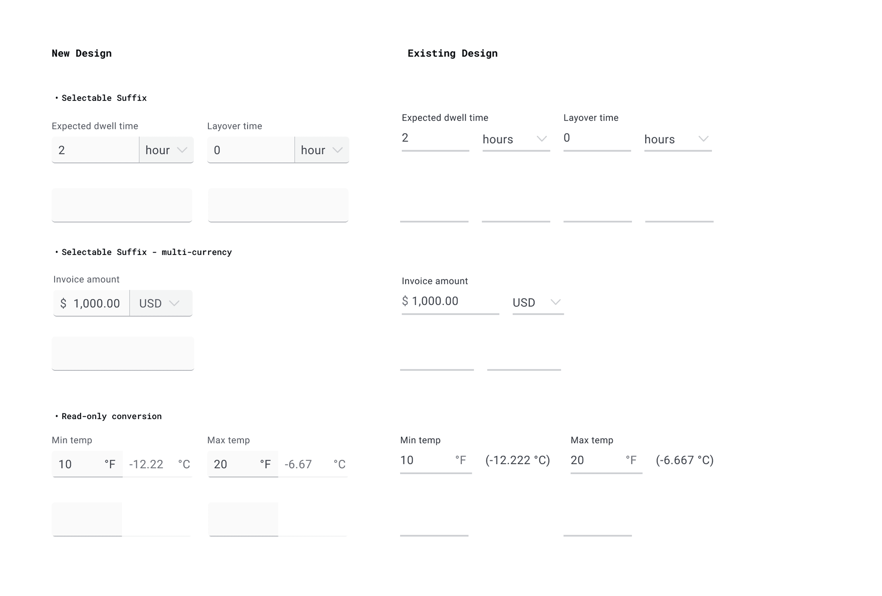
By grouping inputs into one cohesive input, I can reduce the number of inputs on the screen. Having a combo input allows users to finish the task in one mini-zone
To capture as much information as possible, and to allow maximized customization, Turvo allows user to switch units, currency, and etc. However, it also adds to a large amount of bounded input fields to finish one task. To address this issue, I used the combo input components - a component that combines two or more inputs together.
One component for one task
For each mini task, users can finish the value input and unit switch in one component.
Various combination to serve the complexity
The combo components are especially useful for the i18n initiatives, useful to support different measuring systems, currency, time zones and etc.
/ research and solution
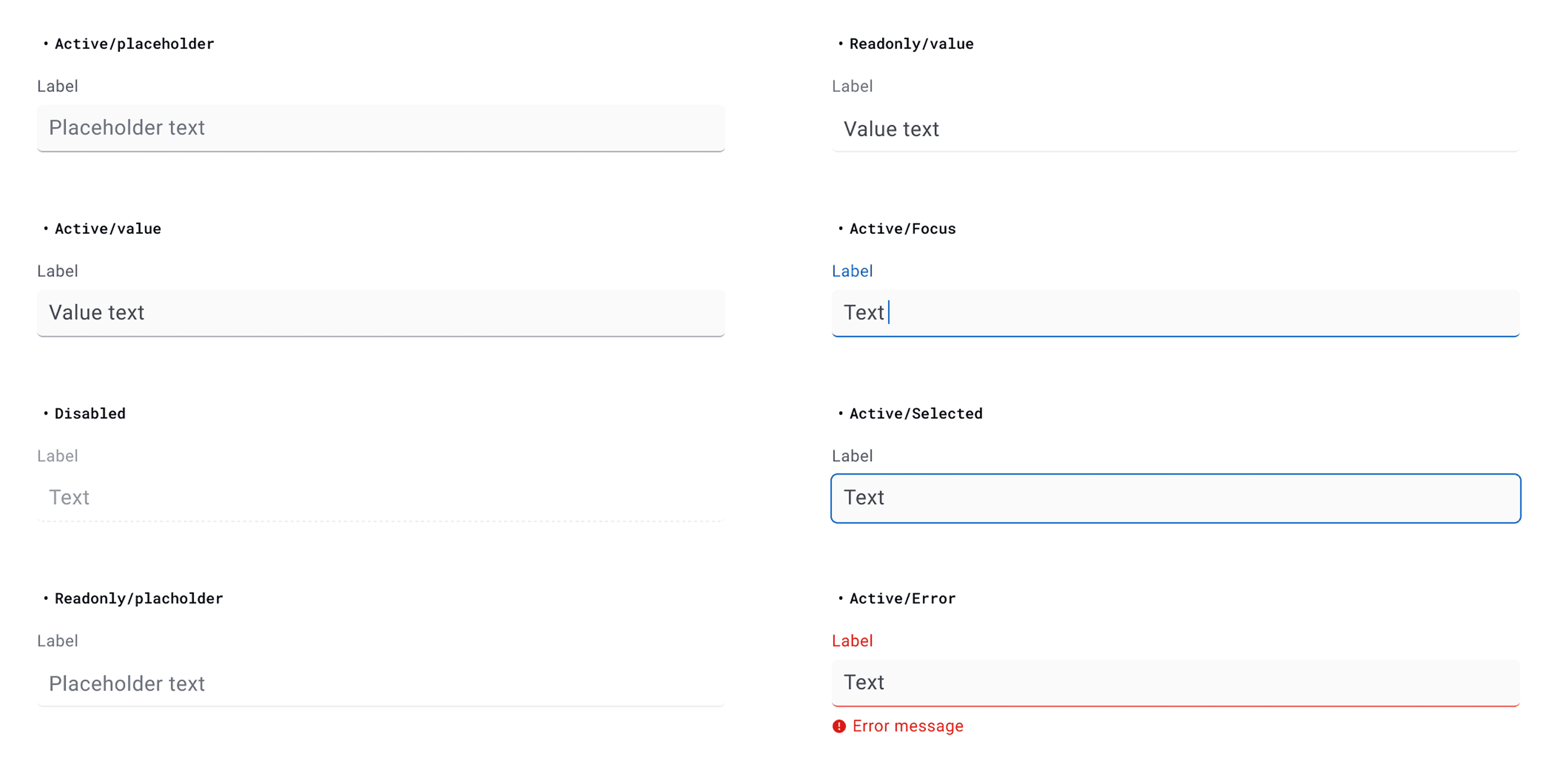
Distinctions between different states
Having a strong distinction between states of active, focus, disabled, read-only, and etc. helps users to go through the form faster and easier.
To support a wide range of states is important to the success of the component design. Also, establishing a clear distinction between states help users skim forms faster.
Clear active vs. non-active fields
Using the light gray background fill as indicator for active fields, users can quickly locate the fields in need of values, and skip non-active (disabled) fields.
Support keyboard navigation
To ensure all forms are accessible, and also allow users to navigate between fields using the Tab key, it is important to have focus states for the components.
/ impact
A delightful form input experience
With the new design of the text inputs, select inputs, combo inputs, the form is more organized and easier to read and to fill.
Just by updating the components, and without excessive work for re-design the layout of each form screens, we are able to bring users a much more delightful experience. There is a clear visual hierarchy, and the field fill offers a clear guidance to users which fields await inputs.
20% decrease in the individual components used per form
By adopting the new input components, we are able to decrease the numbers of individual components used in each form, which means less distraction for users.
100% satisfaction for the component redesign
We were able to have 10 follow up interviews with our users after using the new designs. 100% of the users agree that they like the new input components more and it had helped with their efficiency in some degree.